New stacked bar charts
The stacked bar chart, displays data as horizontal bars like the bar chart, but with each bar divided into colored segments representing different attributes.
Stacked bar charts are typically used when you want to compare aggregated data and the data that it includes together.
New stacked bar chart features
-
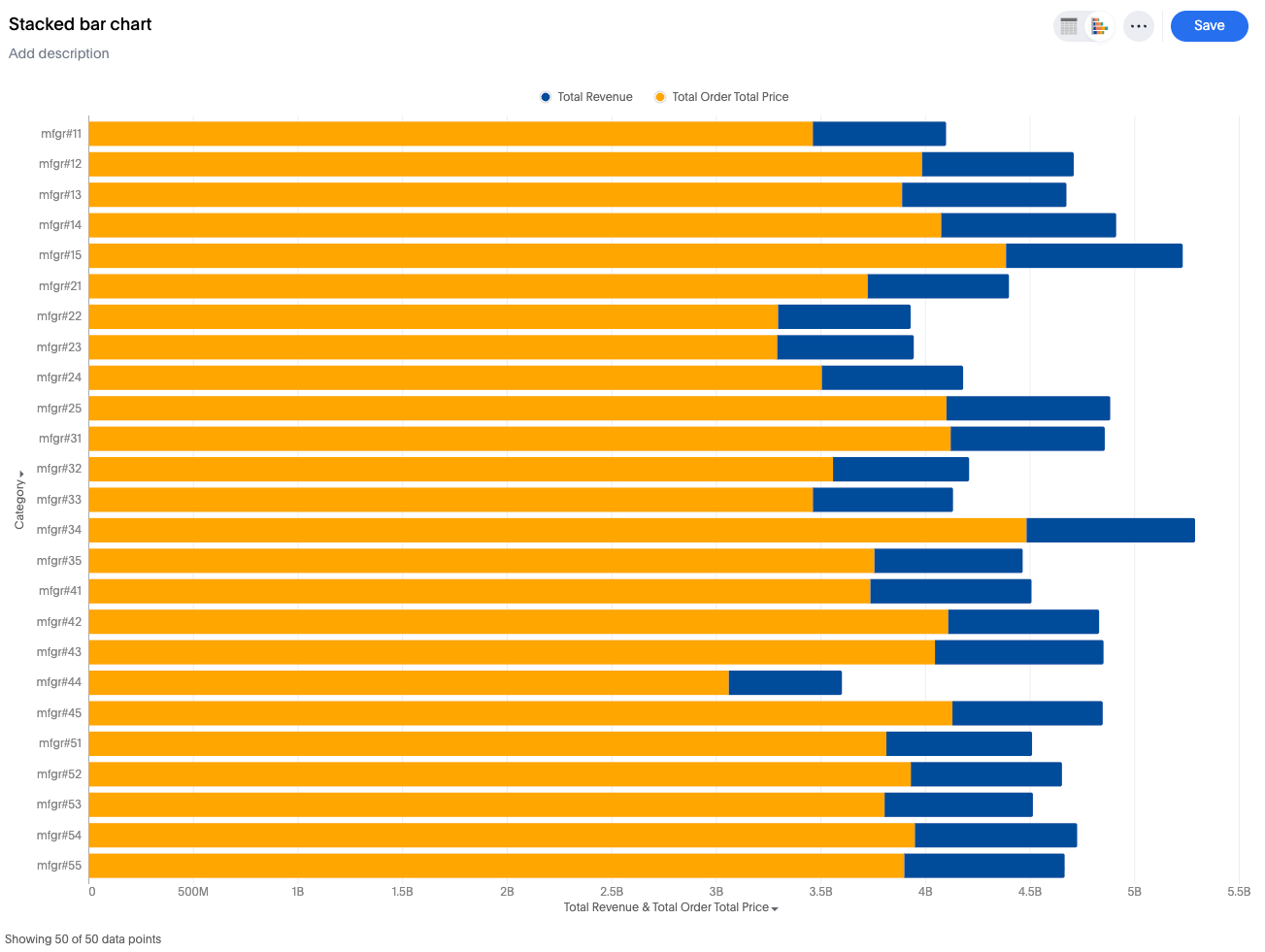
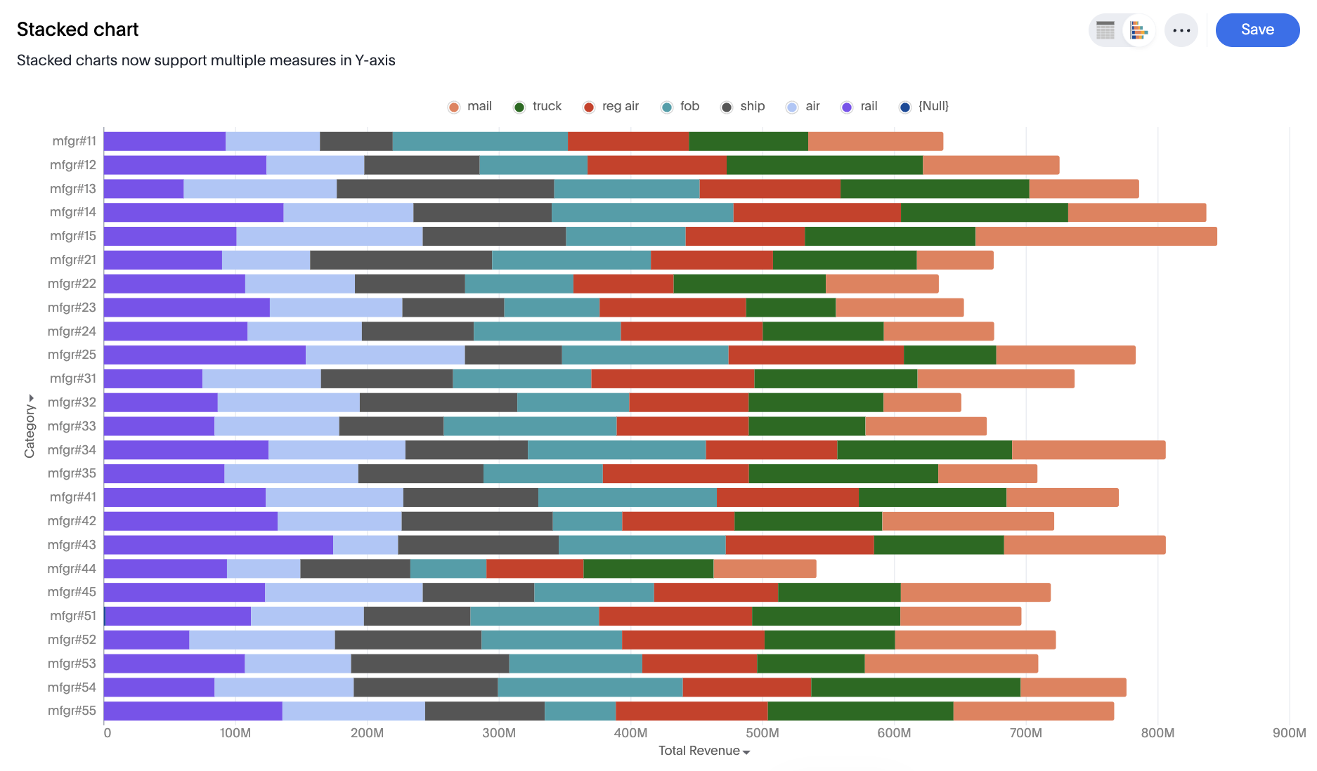
Single Measure Stacked: Sliced by a single attribute using color.
-
Multiple Measures Stacked: Measures are stacked on top of each other, with no slicing by color.
-
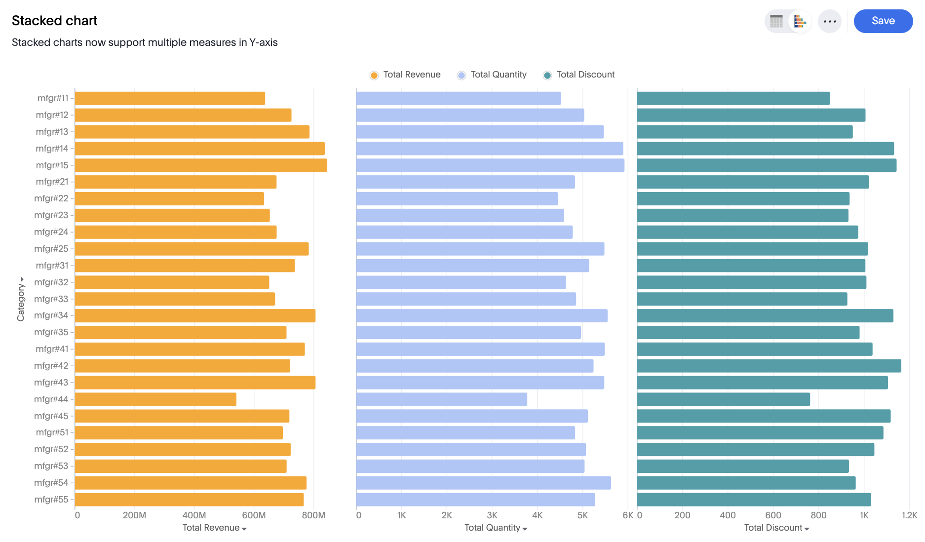
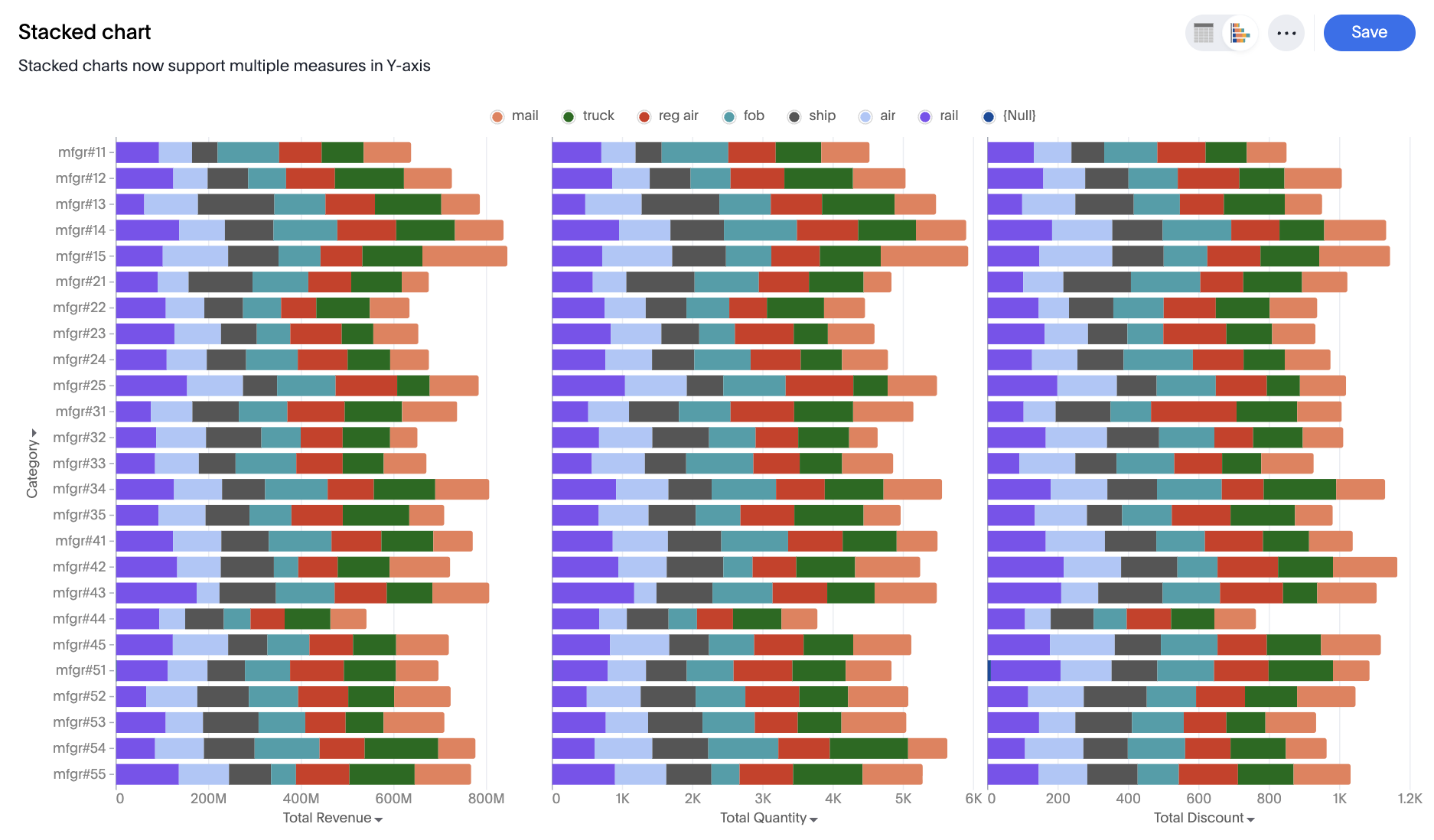
Multivariate Stacked: Each measure forms a separate stacked chart
-
New settings to control column properties like opacity and width to create bullet charts.
Limitations
-
When color slicing is applied to multiple measures, the system automatically converts the visualization into a multivariate chart.
-
Shared-axis configuration is not supported.
-
Dual-axis configuration is not supported.


