New chart settings experience
The new chart settings experience provides a more intuitive configuration panel organized into sections like chart type, layout, column, axis, axis, data label, tooltips, legends, display, and query, where properties for a component are listed with the component.
With this change, you have 50+ new advanced settings available across different chart types. You have pixel-perfect control over every aspect of your visualizations, including data label sizes, colors, font styles, grid lines, tooltips, and more.
Inheritance
You no longer have to configure the same settings multiple times, because commonly used properties are inherited across similar chart elements. For example, if you apply number formatting to one column, it will be applied to multiple columns, though you can change it later if you want.
Advanced mode
By default, chart settings load in basic mode, which provides the most common settings. However, you can change to advanced mode in some settings panels to display additional settings. The advanced setting is saved individually with the setting, so each time you return to the new chart settings experience, it will remember your setting from the last time you used it. Enabling advanced mode in one setting panel, enables it for all settings panels which have an advanced mode.
To enable the new chart settings experience, contact your ThoughtSpot administrator.
Sections
The following buttons on the right side of your chart allow you to control various settings of your chart. The panels available depend on the type of chart you selected.
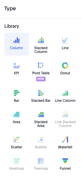
Type
In the Type panel, you select the type of chart you want to use. The type of chart you select determines which other settings panels are available. |
|
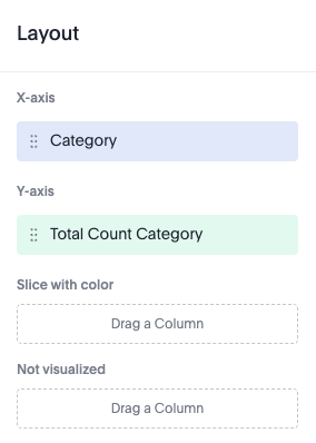
Layout
In the Layout panel, you see the x and y axes of your chart. Depending on the chart, you have access to additional configurations like slice, size with color, size, and more. |
|
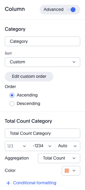
Column
In the Column panel, you can rename the columns, change the sort order, and set numeric, percentage, or currency formatting for the measure. You can also change the color used in the visualization, and set up conditional formatting. If the advanced mode is enabled, you can change the aggregation used. |
|
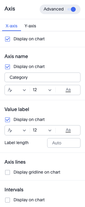
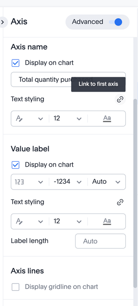
Axis
In the Axis panel, you can rename the axes, change the number format of the value label, and the position of the Y-axis. If the advanced mode is enabled, you can change the format, size and color of the text. You can format the numeric, percentage and currency of the measure, and you can also change the range of the Y-axis, and display axis lines and intervals. |
|
Example: Linking text styling for Y-axes when there are multiple axes present. |
|
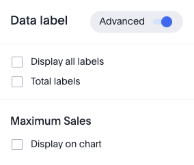
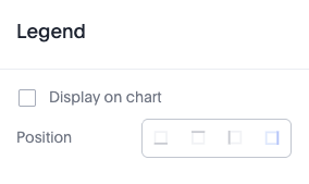
Data label
In the Data label panel, you have various options for displaying, formatting and filtering data labels. |
|
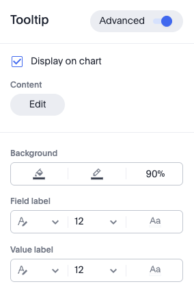
Tooltip
In the Tooltip panel, you have various options for displaying tooltips, including the columns where you want to have tooltips. If the advanced mode is enabled, you can change the background color, opacity, and border color. You can also change the text format, size and color, of field and value labels. |
|
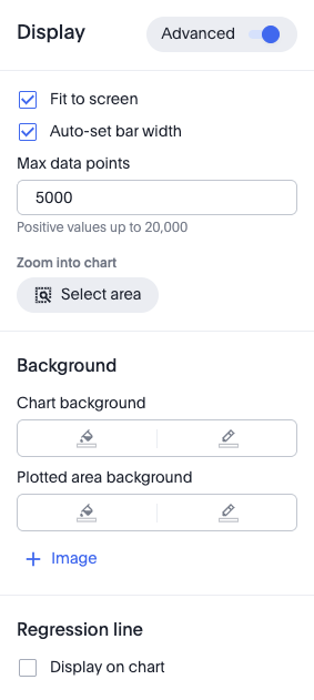
Display
In the Display panel, you have various display options for your chart, including fitting it to the screen, automatically setting bar widths, and maximum data points. You can also zoom into a specific area of the chart. If the advanced mode is enabled, you can change settings like chart and plotted area background and border colors. |
|
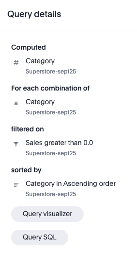
Query
In the Query panel, you can see the details of the query used to generate your chart. You can click Query visualizer to see how ThoughtSpot generated your visualization by displaying the queries, tables, join paths, and fields used. You can also click Query SQL to view the exact SQL query used to generate the chart. |
|